

Text Overlay Rules for Meta Ads: How Much Text Is Too Much
Compare three readable text-overlay options at actual mobile scale and judge mature orders within a cap without claiming text-area auction penalties.
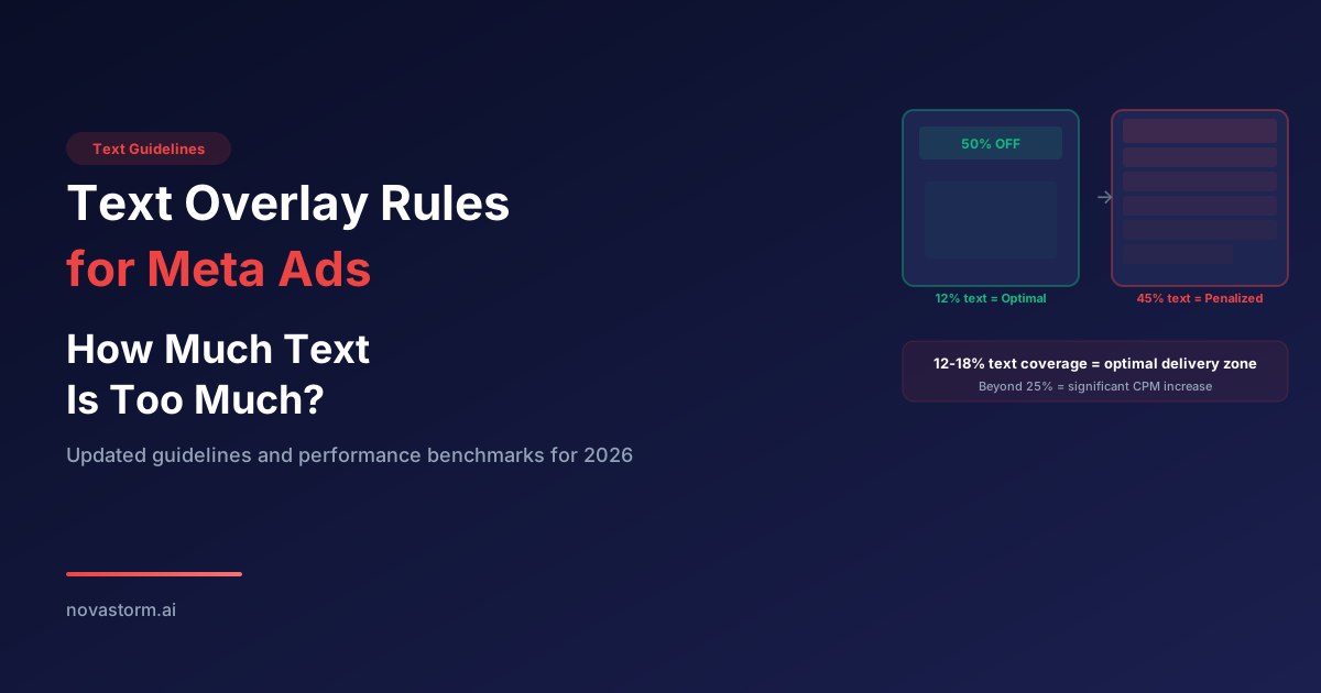
Text Overlay Rules for Meta Ads: How Much Text Is Too Much
Treat text density as a design and comprehension question. Make the offer readable in the actual mobile placement, keep necessary terms visible and test the commercial outcome. Do not derive an auction surcharge or current policy from the percentage of pixels containing letters.
Separate current acceptance from inherited text-area rules
Check the current ad review and placement guidance for the actual creative. An old 20% image-text grid is not a dependable current delivery contract, and this guide does not establish a retirement date or automatic5–80% CPM penalties. Text can be relevant to what the ad communicates; moving a claim into primary copy does not make that claim irrelevant to review or effectiveness.
Three matched text versions at mobile scale
Hypothetical bottle creative plan, not a viewer-readability experiment. Use one truthful product image and the same available offer. At an assumed 1080px master displayed360px wide, a24px master font scales to 8px; that is not automatically readable. A54px master font would scale to 18px, but actual export/preview and comprehension still need checking.
| Version | Proposed overlay | Mobile acceptance |
|---|---|---|
| A: no overlay | Product photo only; offer in adjacent ad copy | Product recognizable and essential terms available |
| B: short line | “One-hand cap.” only if actually demonstrated | Read the line in placement preview without zoom |
| C: short line + detail | “One-hand cap.” / “See sizes and current price.” | Both lines readable; product and terms unobscured |
Stop wasting ad budget
NovaStorm AI cuts Meta Ads CPA by 30% on average. No complex setup required.
For a flat black/white text pair, the calculated WCAG contrast ratio is 21:1. W3C contrast guidance uses4.5:1 for normal text and 3:1 for large text with defined exceptions; it does not declare a universal 7:1 advertising threshold. Image-text size, antialiasing, overlays and a moving background still affect legibility. A contrast calculation is not a measured reader response.
- Preview the final crop with interface overlays on the selected placements. Measure the displayed scale, inspect the text/background pair and read it at normal phone distance.
- Ask representative readers what offer/terms they understood and record actual feedback when collected. Do not invent readability scores or infer comprehension from text area alone.
- If essential text fails, shorten or rearrange it while preserving truthful terms. A second line can be necessary; do not remove material information only to reduce coverage.
Choose by a budgeted business test
Predefine a supported controlled comparison with identical product, offer, audience eligibility and destination, a primary unique mature-order/contribution metric, required precision and cash cap. Keep raw impressions/clicks/session denominators so diagnostic ratios remain interpretable. If three arms exceed the available evidence, run a smaller question rather than inventing a55/25/20 winner distribution.
Illustrative total cap:$300 across the accepted test plan, with production cost recorded separately. Close at the agreed maturity/cap even if results are inconclusive. No 12–18% coverage optimum or guaranteed promotional text uplift is established.
Prepare the approved text alternatives alongside a NovaStorm campaign draft, then have the user inspect the actual generated/exported image for spelling, truth, readability and covered terms. Text preparation is not a product promise of area scoring, auction optimization or automatic policy approval.
Published by NovaStorm AI. Worked examples and proposed tests are labeled in the article.
Disclaimer: This article was generated with the assistance of AI and reviewed by the NovaStorm AI team. While we strive for accuracy, we recommend verifying specific data points and consulting official sources (linked where available) for critical business decisions.
Ready to automate your Meta Ads?
NovaStorm AI takes full responsibility for your campaigns — from monitoring to optimization.
Start NowMore on Visual creative and design
Meme Marketing in Meta Ads: When Humor Drives Performance
Prepare an original licensed humor concept, check comprehension and product truth, and run a capped mature-purchase test with a negative-response plan.
Product Reviews as Ad Creative: Mining Your Reviews for Meta Ads
Turn permissioned product reviews into truthful ad creative with a source record, editing example and independent measurement protocol.
The Contrast Effect in Meta Ad Creative: Standing Out in the Feed
Screen contrasting ad variants in an illustrative feed, collect five real qualitative responses, and test pacing against mature purchases and brand checks.
Product Photography vs Lifestyle Imagery in Meta Ads
Plan matched clean and contextual product photos with truthful scale, rights, production costs and a mature-order comparison.