

Mobile-First Meta Ad Design: Preview, Readability and Form Recovery
Review Meta creative at actual phone size, distinguish artwork pixels from interactive controls, and test slow-network form recovery before approving a draft.
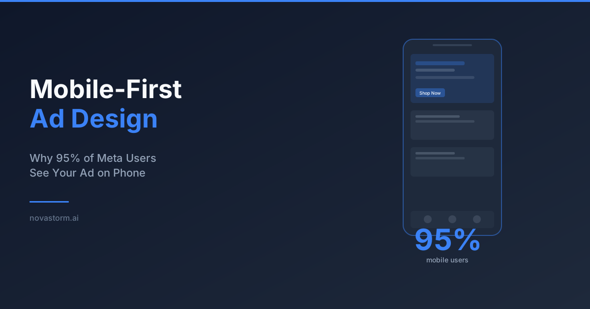
Mobile-first design means inspecting the complete experience at the size and in the app context where it will appear. Use your own device and placement report to decide coverage. A global mobile-user percentage cannot tell you how this campaign’s impressions or purchases are distributed.
Keep artwork pixels separate from interface units
Text exported into an image uses image pixels. A website control uses its rendered interface dimensions; a native app may use platform-specific logical units. A drawn button in an ad is artwork, not an independent tap target. Its size does not establish the size of Meta’s native CTA or of the destination’s form controls.
Illustrative layout specification: a 1,080 × 1,350-pixel image displayed at 360 interface pixels wide scales by one third and is 450 pixels high before cropping. A 72-image-pixel headline becomes approximately 24 interface pixels high under that simple scale. This calculation is not a universal font minimum: line height, font strokes, actual placement and device rendering still need inspection.
| Proposed layout element | Illustrative source coordinates | Phone-size review |
|---|---|---|
| Product and headline | Keep within the central composition of the 1,080 × 1,350 image | At a 360-pixel displayed width, confirm the product and complete headline can be understood without zooming |
| Drawn action label | Use clear words such as “See product details” | Treat it as artwork; confirm the actual CTA and destination separately |
| Offer and important qualifications | Group with the claim rather than at a tiny bottom edge | Check full readability after actual crop and interface overlays |
These coordinates describe a planning canvas, not Meta’s guaranteed safe zones. Check the account’s current preview for each chosen placement. For a vertical version, inspect the real top/bottom interface and caption overlays; move essential content into the area that remains visible. Do not reuse one fixed safe-zone percentage across all formats and app versions.
Capture iOS and Android acceptance evidence
No live ad/device screenshots are presented here. Use this capture protocol for the actual draft: retain an iOS screenshot and an Android screenshot at native display scale, plus the corresponding destination form and confirmation state. Label device, OS, app/browser, placement, viewport, creative version and capture time. An exported mockup is not a device capture.
- Preview the exact saved ad on both device families. Check cropped text, product identity, video captions, native CTA and disclosures without zooming.
- Open the destination from the intended ad context. Confirm the advertised product, price, availability and next action; inspect the on-screen keyboard and validation messages.
- For important interactive destination controls, verify that the actual tap region and spacing allow accurate operation. Enlarging a painted label in the image does not repair a small website submit target.
- Record pass/fail with the screenshot and reproduction steps. Recheck the affected device after a change rather than approving from a desktop canvas alone.
Use the palette and contrast worksheet for readable text pairs and the mobile destination review for page layout. A preview pass demonstrates readability and operability in that tested setup, not a conversion lift.
Stop wasting ad budget
NovaStorm AI cuts Meta Ads CPA by 30% on average. No complex setup required.
Test a slow connection and interrupted submission
Proposed QA scenario, not a completed test: use declared network throttling or a controlled weak connection. Record the settings so the scenario is reproducible. Fill valid form data, interrupt the network before submission completes, then restore it. Protect real personal and payment data by using an appropriate test environment.
| Test step | Required acceptance behavior | Evidence to retain |
|---|---|---|
| Slow initial load | Offer and essential form remain understandable; no overlay hides the action | Timing trace and device capture |
| Submission still pending | Clear pending state; repeated taps do not create duplicate orders | Request/order correlation in the test record |
| Connection restored | Safe retry or clear recovery path, with entered non-sensitive fields preserved where appropriate | Before/after state and one intended outcome |
| Payment may already have succeeded | Reconcile status before retry; do not claim failure solely from a missing screen | Verified order state and recovery message |
Separate lab diagnostics from field performance
According to Google’s PageSpeed Insights documentation, lab diagnostics simulate a setup while field data summarizes real users and may cover the origin when page data is insufficient. Record which scope you are reading. A lab score does not predict a fixed CPA or conversion change.
The current Core Web Vitals targets are LCP at or below 2.5 seconds, INP at or below 200 milliseconds and CLS at or below 0.1, assessed at the 75th percentile in the field. Lighthouse’s load test does not measure actual user INP; its blocking diagnostic is a proxy. Use traces to prioritize fixes, then compare mature paid outcomes separately.
Approve the format and journey together
Put the format-specific copy, crop requirements and device acceptance record into the NovaStorm brief. Prepare the proposal as paused campaign and local ad-set drafts, and approve the actual mobile preview before publication. The screenshot and form-recovery checks belong to the review workflow; this does not claim automatic device testing or guaranteed sales improvement by NovaStorm.
Published by NovaStorm AI. Planning examples are illustrative assumptions, not measured customer results.
Disclaimer: This article was generated with the assistance of AI and reviewed by the NovaStorm AI team. While we strive for accuracy, we recommend verifying specific data points and consulting official sources (linked where available) for critical business decisions.
Ready to automate your Meta Ads?
NovaStorm AI takes full responsibility for your campaigns — from monitoring to optimization.
Start NowMore on Ad formats and placements
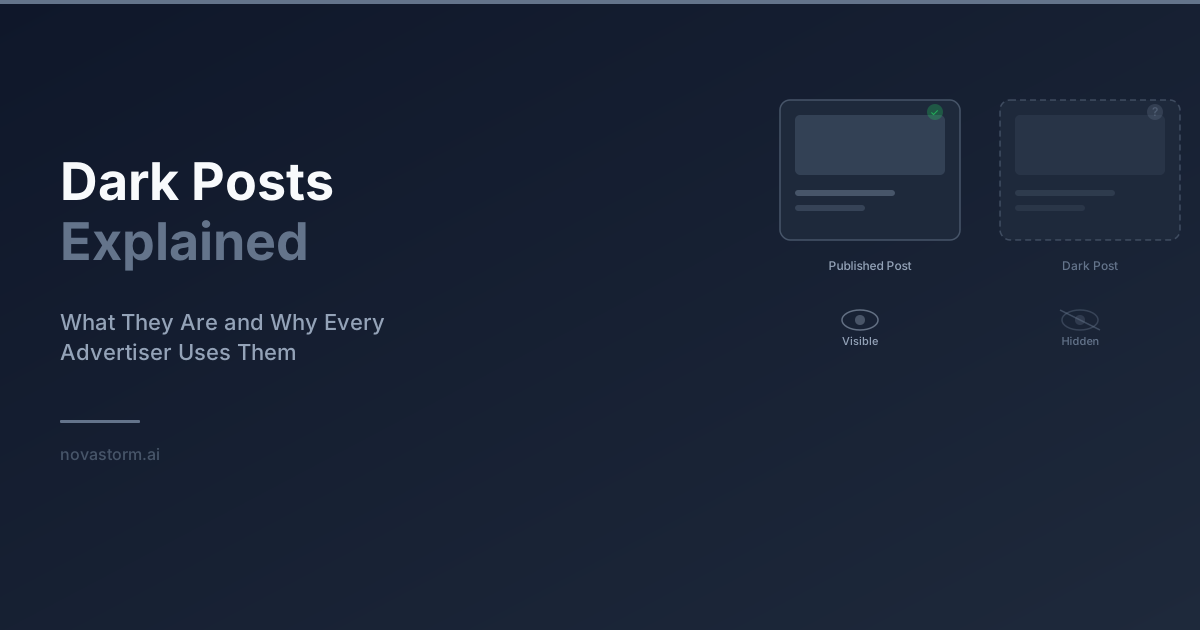
Dark Posts Explained: Ad-Only Content, Post IDs and Review
Understand ad-only posts, verify post-ID reuse by format, and keep a version and approval log without assuming privacy or transferred engagement.
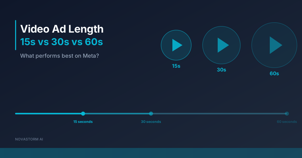
Video Ad Length on Meta: How to Compare 15-, 30- and 60-Second Edits
Compare 15-, 30- and 60-second Meta video edits with explicit metric definitions, a controlled message, a cash-risk limit and mature business outcomes.
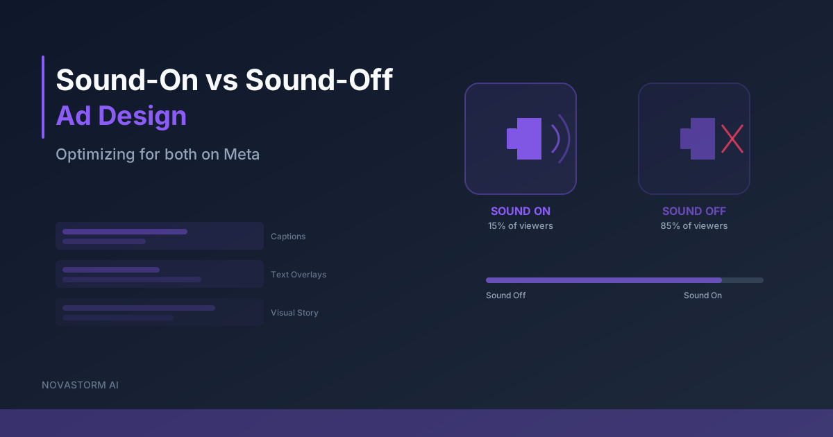
Sound-On vs Sound-Off Ad Design: Optimizing for Both on Meta
Review one Meta video with sound on and muted, correct captions, verify music rights and check text against the actual placement preview.
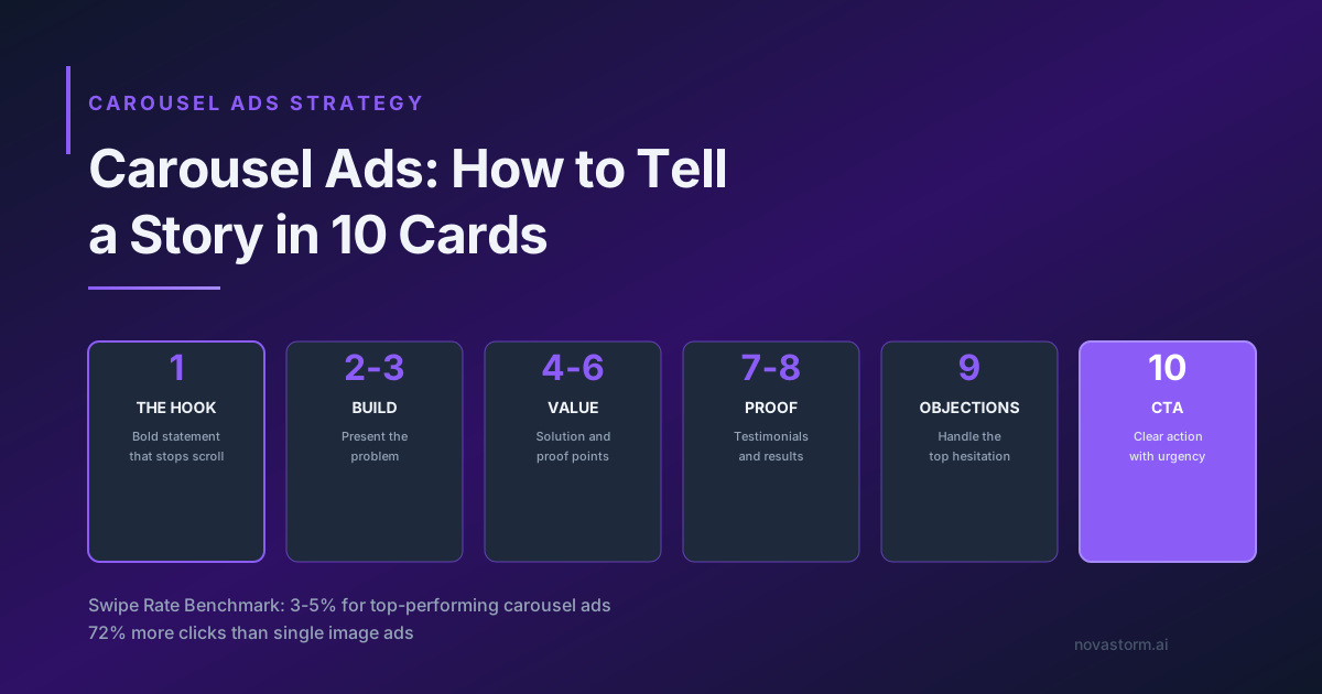
Carousel Ads: How to Tell a Story in 10 Cards
Create a ten-card carousel storyboard, check every destination and test order against mature purchases rather than swipe benchmarks.