

Visual Hierarchy in Ad Design: Guide the Eye to the CTA
Specify a readable ad layout at its displayed mobile scale, measure text contrast and test one hierarchy change against mature acquisition cost.
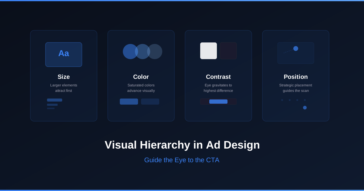
Visual hierarchy is a proposed order of importance: product, offer, terms and next action. Verify that order in the actual placement preview instead of assuming that every viewer follows an F- or Z-shaped gaze path. This article provides a production-ready text specification, not a measured gaze map or a finished photographed asset.
Separate image text from interface controls
A button drawn inside a raster ad is part of the image. It is not an independently tappable web control. Meta’s placement interface and your landing-page buttons have their own interaction targets. The W3C target-size minimum criterion concerns pointer targets in CSS pixels, including spacing exceptions; it does not prescribe the font size of text in an uploaded image.
A mobile-scale layout specification
This hypothetical backpack offer uses a 1080 × 1350 source canvas displayed at 360 × 450 CSS pixels, a one-third scale. The exact dimensions are a design example, not a guarantee of current placement support. Verify the actual crop and controls in your account before export.
| Element | Finished copy and placement specification | Source size → displayed size |
|---|---|---|
| Headline | A backpack for your daily commute; top text zone, two lines maximum | 72 px type → 24 px at one-third scale |
| Product | Approved backpack photo, center zone; no text over product details | Same photograph and crop in both variants |
| Supporting offer | Explore compartments, dimensions and delivery details | 48 px type → 16 px |
| Action text | See backpack details; clear bottom text zone | 54 px type → 18 px |
| Required terms | Use the actual material and delivery terms; shorten other copy if necessary | 48 px type → 16 px; verify readable in the real preview |
These sizes are chosen starting points, not universal minimums. A 14-pixel letter in a 1080-pixel source would display at about 4.67 pixels under this scale. That is why checking only the design editor at 100% is insufficient. Review without zooming, with platform overlays and with any crop; do not hide necessary terms in tiny type.
Measured color contrast
Stop wasting ad budget
NovaStorm AI cuts Meta Ads CPA by 30% on average. No complex setup required.
| Text/background hex pair | Calculated contrast ratio | Interpretation for this specification |
|---|---|---|
| White #FFFFFF / dark #0E0B14 | 19.51:1 | Strong contrast for the proposed text areas |
| White #FFFFFF / pink #F20C59 | 4.22:1 | Below a 4.5:1 normal-text comparison threshold |
| White #FFFFFF / darker pink #B50940 | 6.82:1 | Above that normal-text comparison threshold |
Ratios are calculations from opaque sRGB colors using relative luminance: (lighter luminance + 0.05) ÷ (darker luminance + 0.05), rounded to two decimals. They do not measure actual audience attention or a transparent/textured background. The W3C contrast guidance distinguishes normal and large text; one contrast calculation does not establish full accessibility compliance. Recheck the actual rendered pixels after compression or overlays.
Before and after with the same offer
Illustrative before: the headline, supporting copy and action all use the same 48-pixel source type, so they all display around 16 pixels. Illustrative after: enlarge only the headline to 72 pixels, keeping copy, image, color, price, placement and destination unchanged. This isolates headline prominence; a wholesale redesign with several changes could be useful but would not identify one variable’s effect.
- Approve the real product photo and factual offer, then render both specified layouts at the actual mobile display scale. Record which terms a reviewer can read; review gaze predictions only as hypotheses.
- Set stable assignment, exposure cap, sample plan, commercial metric and maturation period. Use the available experiment method and keep all other offer and delivery settings comparable.
- Primary decision: retained purchase CPA and contribution after the defined refund window. Treat click rate as a diagnostic and check outcome collection before interpretation.
- Hypothetical arithmetic: $240 and 12 retained purchases give CPA $20; $240 and 10 give CPA $24. These small synthetic results demonstrate calculation only, not an observed hierarchy lift or a statistically established winner.
NovaStorm can support proposed creative preparation for human approval in paused campaign and local ad-set drafts. A reviewer still checks readable exports, truthful terms and placement crops. The creative testing framework supplies the test structure; no audience heatmap, neural analysis or guaranteed CPA improvement is claimed.
Published by NovaStorm AI. Planning examples are illustrative assumptions, not measured customer results.
Disclaimer: This article was generated with the assistance of AI and reviewed by the NovaStorm AI team. While we strive for accuracy, we recommend verifying specific data points and consulting official sources (linked where available) for critical business decisions.
Ready to automate your Meta Ads?
NovaStorm AI takes full responsibility for your campaigns — from monitoring to optimization.
Start NowMore on Visual creative and design

E-commerce Product Photography for Meta Ads: Plan and Test Visual Styles
Plan product-only, contextual and detail photos with accuracy and rights checks, then compare mature customer economics including production cost.

Advantage+ Creative Enhancements: What Meta Auto-Changes and When to Opt Out
Review the creative enhancements actually available in your account, preserve the approved source and test brand-safe settings against mature outcomes.
Thumb-Stop Rate: Calculate Attention and Check Acquisition Cost
Calculate thumb-stop rate with a consistent impression denominator and evaluate openings against mature acquisition cost, not attention alone.
Product Photography vs Lifestyle Imagery in Meta Ads
Plan matched clean and contextual product photos with truthful scale, rights, production costs and a mature-order comparison.